Teaching Scatterplots: Building Foundations for Data Analysis
Scatterplots are an essential tool in middle and high school math classes, bridging the gap between raw data and meaningful analysis. They provide students with a visual representation of relationships between two quantitative variables, laying the groundwork for concepts like the line of best fit, correlation coefficients, and residual plots. By teaching scatterplots effectively, we equip students with skills to analyze and interpret real-world data.
What Are Scatterplots?
A scatterplot is a graph that uses Cartesian coordinates to display values for two variables in a dataset. Each point on the graph represents an individual data pair, making scatterplots an excellent way to observe patterns, trends, and potential relationships.
Why Teach Scatterplots?
Visualizing Relationships: Scatterplots help students understand how one variable might influence another.
Preparation for Advanced Topics: They provide a foundation for understanding lines of best fit, calculating correlation coefficients, and constructing residual plots in later courses.
Data Interpretation Skills: Scatterplots give students hands-on experience analyzing trends, outliers, and variability, essential for interpreting real-world data.
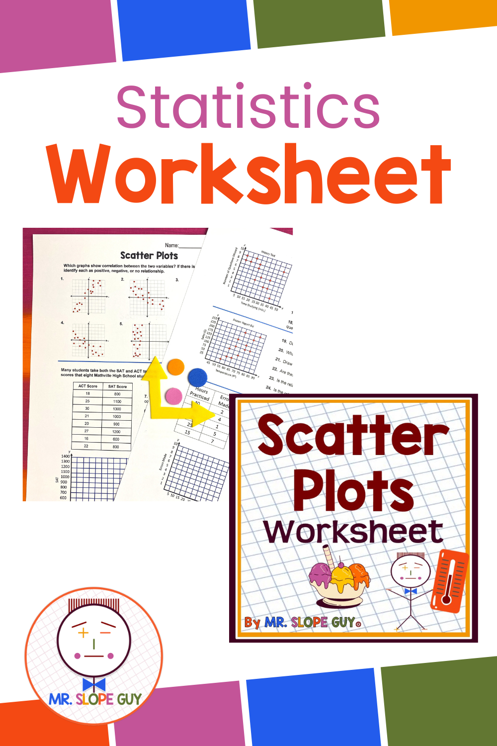
Engaging Example: Ice Cream Sales and Hot Days
One of the simplest and most relatable examples of a scatterplot involves showing the relationship between ice cream sales and temperature.
Scenario:
Data is collected over several summer days, recording the daily temperature and corresponding ice cream sales
Temperature (°F) Ice Cream Sales ($)
75 200
80 300
85 400
90 600
95 750
Steps for Teaching the Example:
Create the Scatterplot:
Have students plot the data points on a coordinate grid, with temperature on the x-axis and ice cream sales on the y-axis.Identify Trends:
Guide students to observe the positive correlation: as temperature increases, ice cream sales also increase.Predict Future Values:
Discuss how the scatterplot could help estimate ice cream sales for a temperature of 100°F, reinforcing the concept of using data trends for predictions.Relate to Line of Best Fit:
Introduce the concept of drawing a line of best fit through the data points to summarize the trend.
Key Topics to Cover When Teaching Scatterplots
Types of Correlation:
Positive Correlation: Both variables increase together (e.g., temperature and ice cream sales).
Negative Correlation: One variable increases as the other decreases (e.g., gas prices and miles driven).
No Correlation: No apparent relationship between variables (e.g., shoe size and test scores).
Outliers:
Discuss how a data point that doesn’t fit the trend (e.g., a day with low ice cream sales despite high temperatures) can affect the interpretation of a scatterplot.Line of Best Fit:
Teach students to draw a line of best fit by estimating the line that most closely follows the data’s trend. This skill is crucial for understanding future concepts like regression analysis.Correlation Coefficients:
Introduce the idea that the strength of a relationship can be measured numerically, paving the way for calculating the correlation coefficient r in advanced classes.Residual Plots:
Explain that residual plots help assess how well a line of best fit represents the data by showing the differences between observed and predicted values.
Hands-On Classroom Activities
Data Collection:
Have students gather their own data, such as hours of study and test scores, or height and arm span, to create personalized scatterplots.Group Discussions:
Divide the class into small groups, giving each group a different scatterplot. Ask them to identify trends, correlations, and possible outliers, then present their findings to the class.Technology Integration:
Use tools like Desmos, Geogebra, or Excel to create scatterplots digitally and explore dynamic changes by adjusting data points.
Conclusion
Teaching scatterplots is more than plotting points; it’s about fostering a deep understanding of data relationships. Using relatable examples, like ice cream sales on hot days, makes abstract concepts concrete and engaging. By mastering scatterplots, students develop critical skills they’ll use in advanced math, science, and everyday decision-making.
Scatterplots aren’t just about numbers; they tell stories. Let’s help students become confident data storytellers!